BRAND CASE STUDY
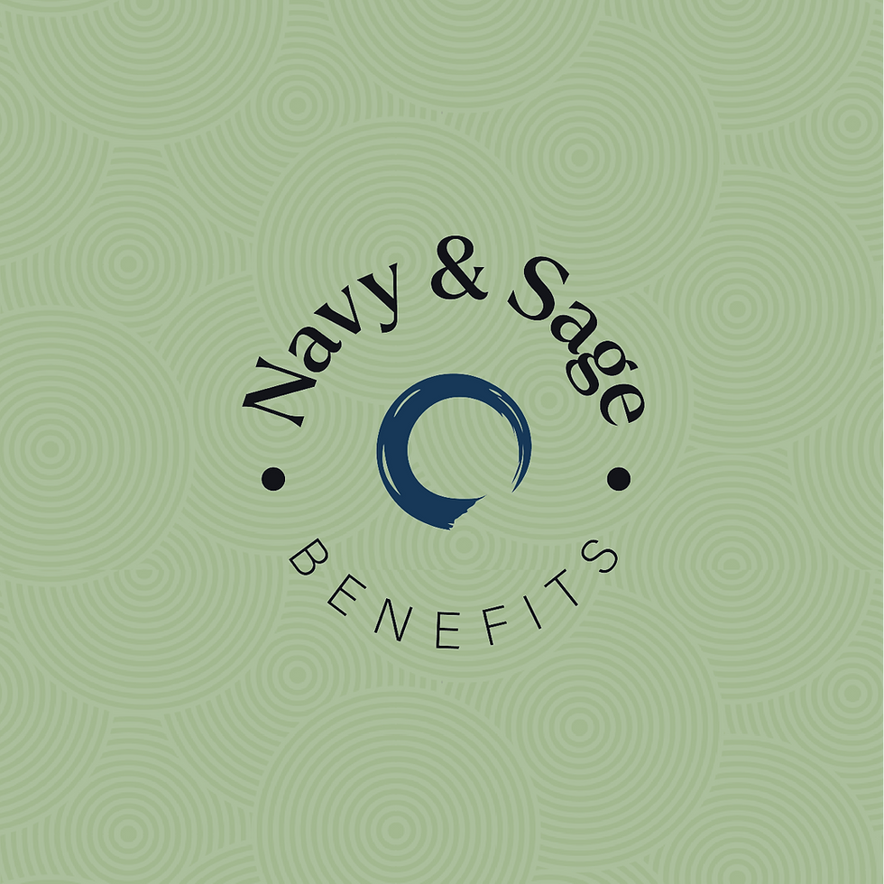
Navy & Sage Benefits
VISUAL IDENTITY
PRINT DESIGN
Featured in Design Rush's Best Print Designs for 2025
Navy & Sage Benefits is on a mission to restore humanity to insurance. Their expert team guides business leaders through a simple process so that each client can get the best plan for their budget and the support to make their lives easier.


THE PROBLEM
Their old, dated logo was misrepresenting their high-level services
The old logo did not reflect the high level of service & skill provided by the Navy & Sage team. They recognized the need for a brand refresh in order to step into a new phase of business growth.

BEFORE

THE SOLUTION
A cohesive visual system that is modern, professional, and distinctly human
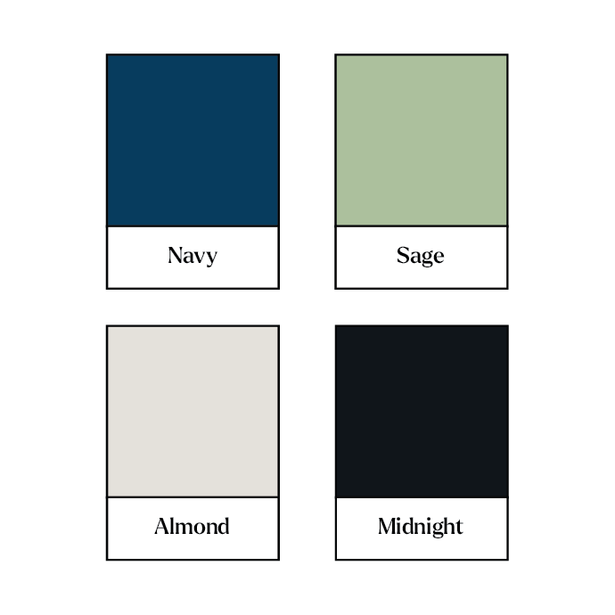
After researching the industry and getting to know the unique needs of their ideal clients, we repositioned the brand to stand out in the competitive landscape. The new brand accurately reflect their services: high-level professionalism with the perfect human touch. This meant a new logo suite, updated brand colours, typography pairing, along with an easy-to-follow usage guide on how to use all of their fresh, new brand elements.

AFTER

THE RESULT
An aligned brand that reflects core values & resonates with ideal clients
We created a human-centred brand that is distinctly approachable in an otherwise corporate and impersonal industry. The design speaks to client needs and reflects the client experience: reduced anxiety, increased clarity, and customized professional solutions.
